Case study
02
/03
TruValu
Industry
Automotive / Marketplace
Platform
iOS / Android
Role
UI/UX design
Year
2023
(01) Overview
A marketplace that starts near you.
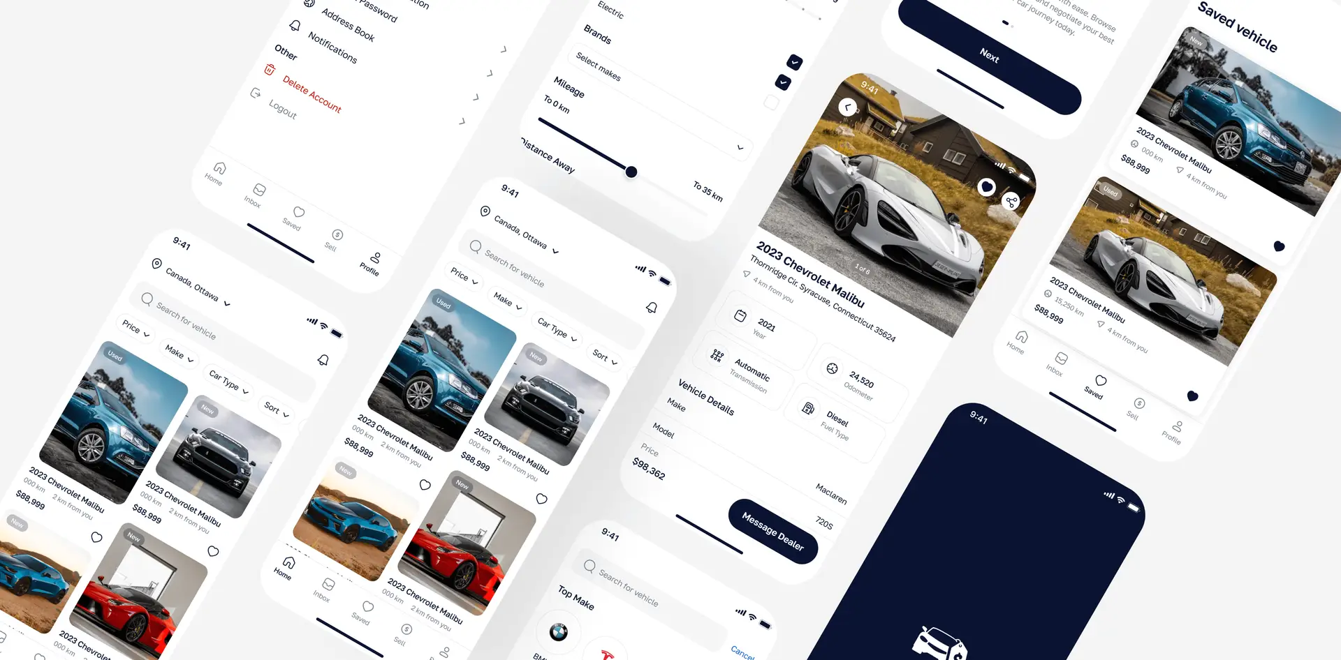
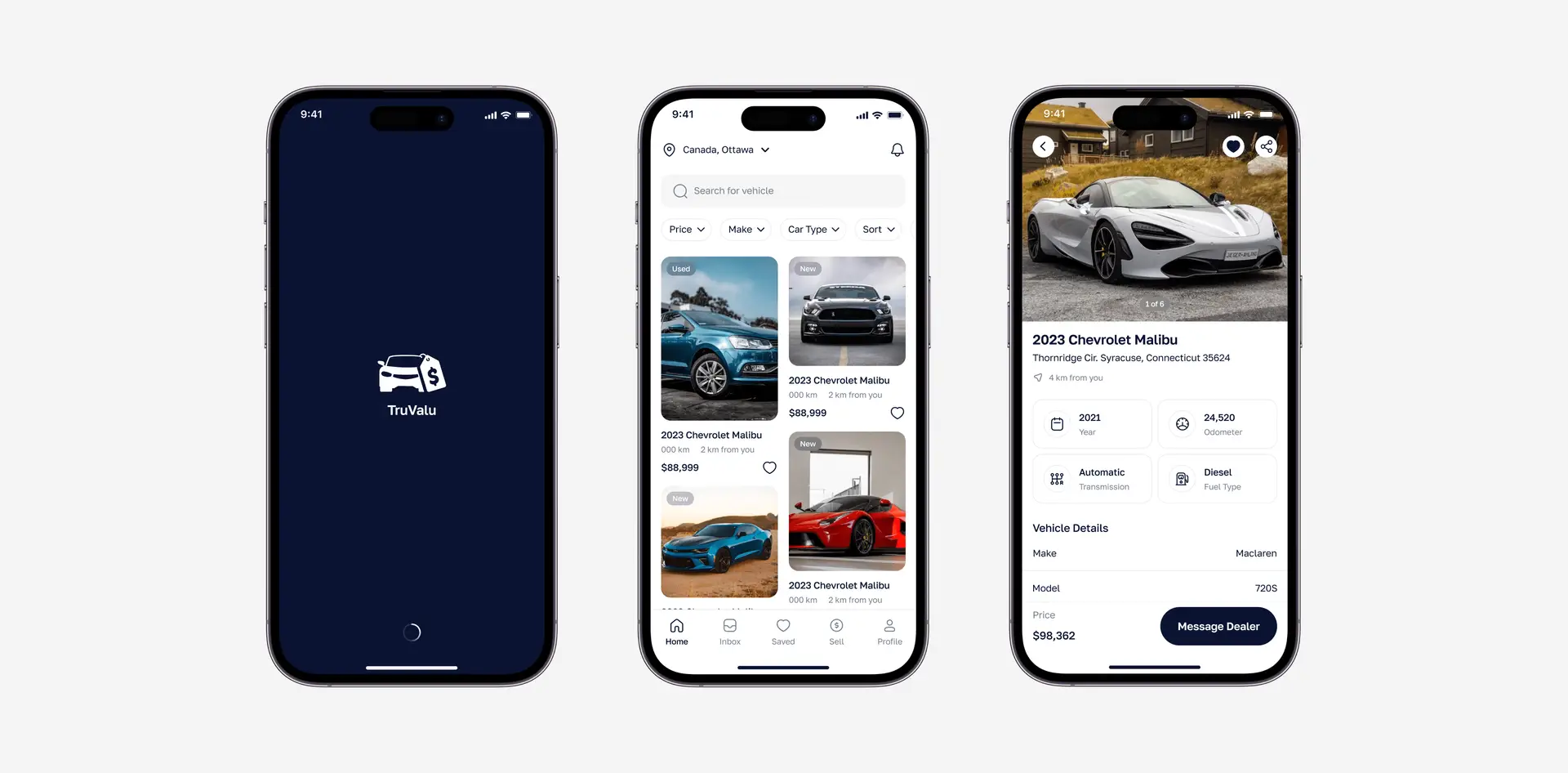
TruValu is a mobile marketplace for new and used cars. Search opens on your location, listings show price, mileage and distance up front, and every car page ends with a direct line to the dealer. Saved vehicles, an inbox and a Sell tab round out the app.
[TODO] Product background: who the client was, target market, launch status, team and your exact scope.
(02) Problem
Too many cars. Too little signal.
Car listings are dense: make, model, year, mileage, fuel, transmission, price, location. The design problem: help people narrow a large inventory quickly, then judge one car with confidence without drowning them in spec sheets.
[TODO] This is my reading of the problem from the final screens. Replace it with the brief’s real problem statement if it differs.
(03) Flow
Filter first, then decide.
Filters sit right under search as one-tap chips (Price, Make, Car Type, Sort) with a fuller panel for brands, mileage and distance. Listing cards lead with the photo, New/Used tag, price, kilometres and distance. The detail page turns specs into four quick tiles (year, odometer, transmission, fuel) before the full list, and pins ‘Message Dealer’ beside the price.
Search. Filter. Compare. Message.
Search nearby: Search opens on your city, with filter chips one tap away.
Narrow it down: Brands, mileage and distance in one filter panel.
Read the car: Photos first, then four spec tiles and the full vehicle details.
Message the dealer: Price and the one action that matters, side by side.
[TODO] Process stages listed on the old page (Research, User flows, Wireframes, Visual direction, High-fidelity UI, Prototype): keep only the ones you actually did, and add real artefacts such as flow diagrams or sketches.
(04) Interface
Quiet chrome, loud cars.
Cards: Photo-led listings with New / Used tags
Filters: Chip row plus full filter panel
Actions: Navy pill buttons — Message Dealer
Navigation: Bottom tabs — Home / Inbox / Saved / Sell / Profile
[TODO] Colour tokens and typeface: the old page used values sampled from exports (Primary #0A0A32, Canvas #F0F0F2, Text #111114). Replace them with the real Figma tokens and add the type scale.
Less scrolling. More deciding.
The design outcome: search that starts local, filters that stay in reach, listings you can compare at a glance, and a detail page where the next step is never more than a thumb away.
[TODO] Verified results only: launch status, store rating, client feedback, usage numbers. Never invent metrics.
[TODO] More exports: individual screens at full resolution, device mockups, and a short screen recording of the prototype.
(05) Screens
Drag / use arrow keys
(06) Next project
Fitness & health
Female Fitness

Mrh Raju
Portfolio ©2026
Loading
000