Case study
01
/03
Get Super
Industry
Fitness & health
Platform
iOS / Android
Role
UI/UX design
Year
2023

(01) Overview
One place for the whole day of training.
Get Super brings workout logging, meal and macro tracking, water intake, and step counting into a single mobile app. The home screen sums up the day: calories, meals, water, steps, and points straight to the next exercise.
[TODO] Product background: who the client was, target market, launch status, team and your exact scope.
(02) Problem
Four trackers. One glance.
Activity, nutrition and hydration usually live in separate tools, so people end up juggling numbers across screens. The design problem: show progress on several daily goals at once without turning the home screen into a spreadsheet.
[TODO] This is my reading of the problem from the final screens. Replace it with the brief’s real problem statement if it differs.
(03) Flow
Numbers you can read, not decode.
Every goal got a visual that matches how it’s measured: rings for macros, bars for calories across the day, a running count for water and steps. Exercise building starts from the body: pick a muscle group on an anatomy map, then add sets, reps and weight.
Check the day. Log it. Train.
Today: Calories, meals, water and steps on one screen, with a shortcut into the next workout.
Log a meal: Meals broken into carbs, fat and protein, shown as rings against the daily target.
Pick a muscle: Exercises start from the body: tap a muscle group on the anatomy map.
Build the set: Name the exercise, then add sets, reps and weight row by row.
[TODO] Process stages listed on the old page (Research, User flows, Wireframes, Visual direction, High-fidelity UI, Prototype): keep only the ones you actually did, and add real artefacts such as flow diagrams or sketches.
(04) Interface
A soft system for hard numbers.
Cards: Large radius, white on soft grey
Actions: Pill buttons in the primary violet
Data: Rings, bars, line graph, counters
Navigation: Bottom tabs — Home / Exercise / More
[TODO] Colour tokens and typeface: the old page used values sampled from exports (Primary #7B7EF2, Canvas #F4F4F6, Text #111114). Replace them with the real Figma tokens and add the type scale.
Less digging. More doing.
The design outcome: a home screen where four daily goals read at a glance, nutrition that’s visual instead of numeric, and an exercise builder that starts from the body rather than a long list.
[TODO] Verified results only: launch status, store rating, client feedback, usage numbers. Never invent metrics.
[TODO] More exports: individual screens at full resolution, device mockups, and a short screen recording of the prototype.
(05) Screens
Drag / use arrow keys
(06) Next project
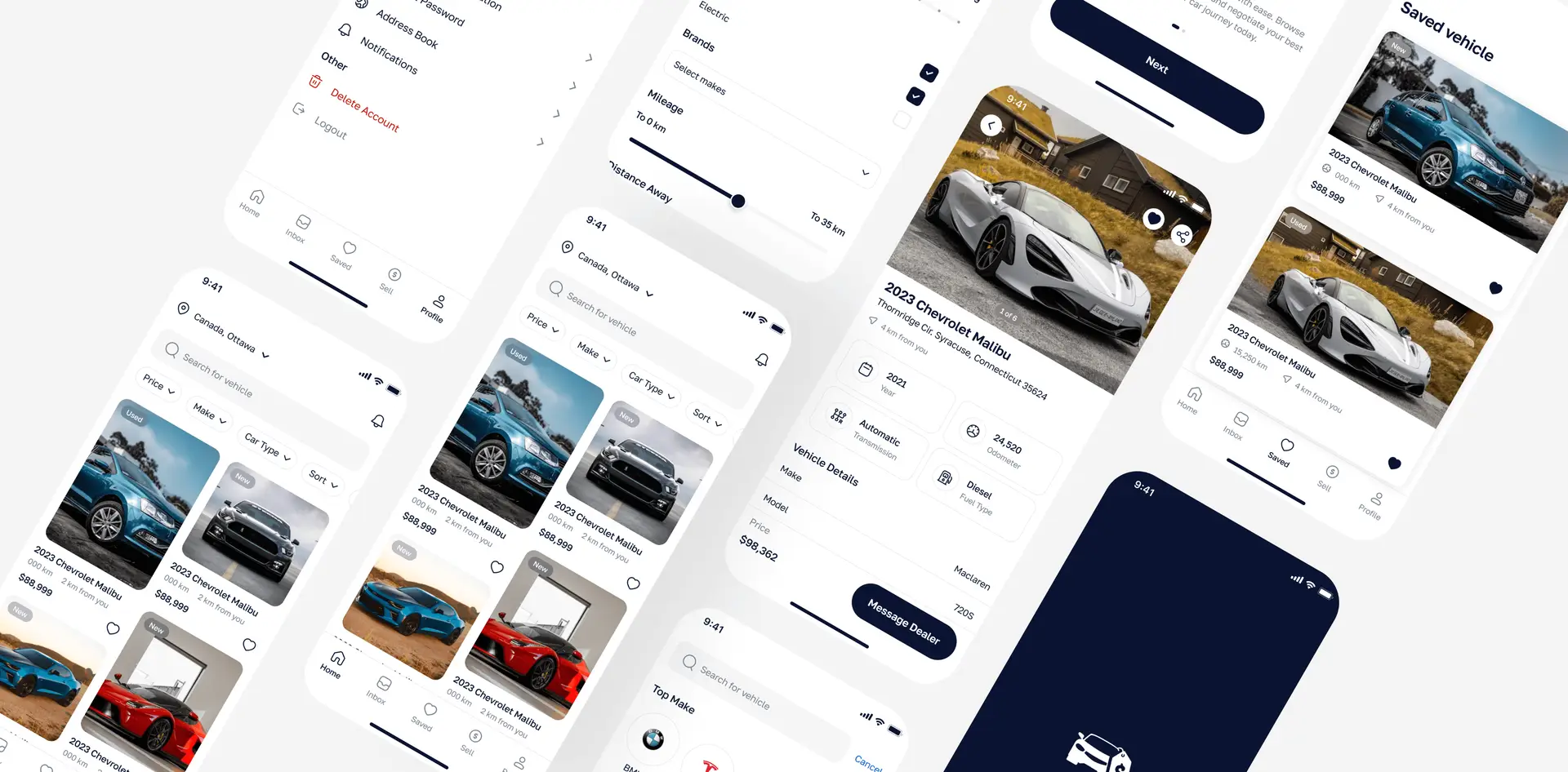
Automotive / Marketplace
TruValu
Mrh Raju
Portfolio ©2026
Loading
000